NRF Exam Screen

Overview:
The objective of this project is to enhance the user experience of an exam screen. We aimed to craft a seamless and engaging user experience that caters to the unique needs of Spanish-speaking students within the retail sector.
-
Interaction Designer, UX Designer, UI Designer
-
User Personas, Conceptual Development, Wireframing, Interaction Design, High-Fidelity Prototyping
-
Figma
-
May 2023
UNDERSTANDING THE PROBLEM
Spanish-speaking students in the retail industry face unique challenges when taking exams designed for a general audience. These challenges can hinder their ability to learn effectively and accurately assess their knowledge. Here's a deeper look at the problems we're aiming to solve:
Language Barriers: Exams might be offered primarily in English, requiring students to translate on the fly, which can be time-consuming and lead to misunderstandings.
Lack of Cultural Nuance: Exam content and terminology might not reflect the specific retail industry context relevant to Spanish speakers.
These factors can lead to:
Increased Stress and Anxiety: Difficulty understanding the exam can cause unnecessary stress and hinder performance.
Lower Scores: Language barriers and unclear instructions can lead to students answering questions incorrectly.
By understanding these problems, we can design an exam screen experience that is not only translated into Spanish, but also culturally relevant, accessible, and engaging for Spanish-speaking retail students. This will allow them to focus on demonstrating their knowledge and learning effectively.
Challenge:
Create an exam screen experience that is optimized for Spanish-speaking students in the retail industry.
Potential Solutions:
Utilize clear and consistent icons and visuals: Icons can act as visual cues to support comprehension, especially for those with lower literacy levels.
Emphasize key information: Use bolding, highlighting, and clear formatting to make important instructions and questions stand out.
Simple and intuitive navigation: The layout should be easy to follow, with clear buttons and progress indicators.
Translation tool: Offer a built-in translation tool for specific terms students may be unsure of.
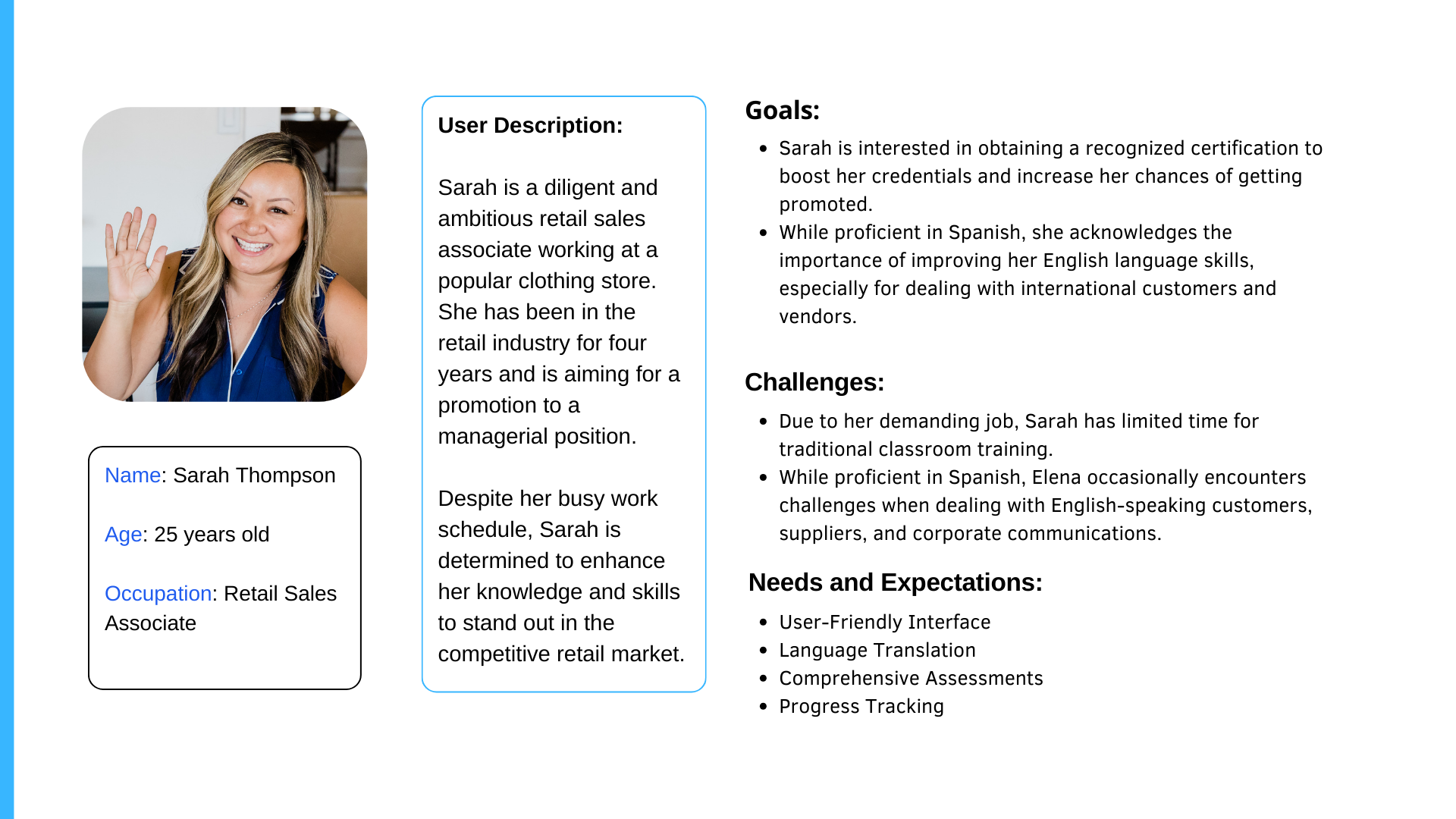
USER PERSONA
To understand the user, I created a user persona after conducting thorough research and considering the product's objectives and challenges. It encompasses key demographic details, behaviors, preferences, and goals. This gives me a comprehensive understanding of the target audience, especially their needs and expectations, guiding the design and development process effectively.
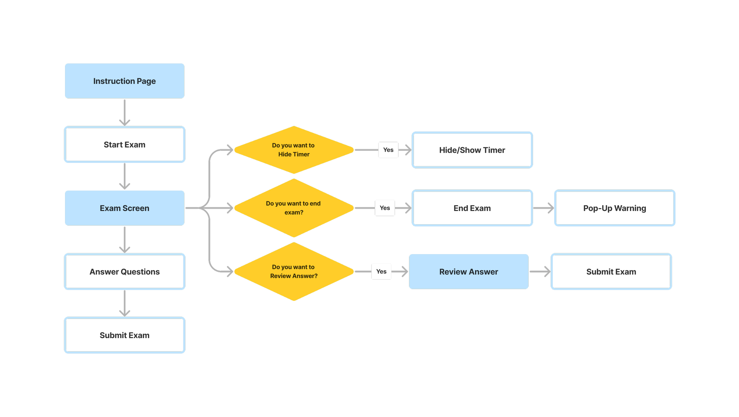
APPLICATION MAP
I visualized the logical flow of the online exam process, ensuring that users would easily navigate their exam. It visually represents the steps a student takes, from logging in to receiving post-exam feedback, highlighting key screens and functionalities. This map will ensure a smooth and intuitive exam experience tailored to their needs.
KEY FEATURES
After mapping the screen flow, I proposed the initial screen designs with key features below:
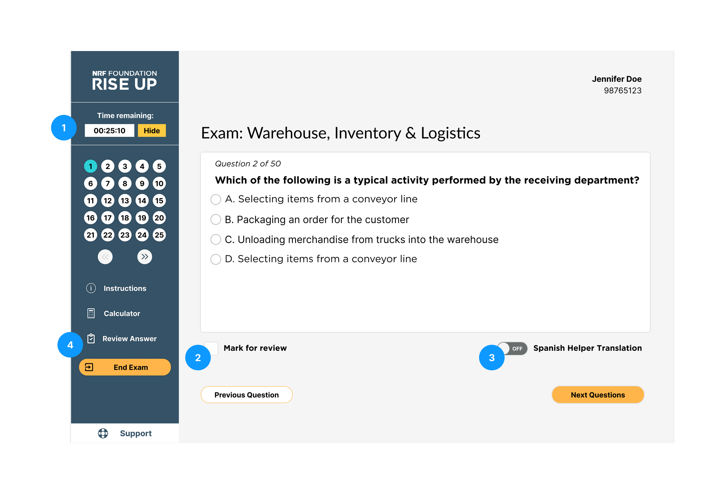
Timer: Countdown timer to show the time left. Users can hide this feature by clicking the Hide button.
Mark for Review: Users can highlight questions to review later by clicking Mark for Review.
Spanish Helper Translation: Users can activate this feature and the exam content, including questions and answer choices, is translated into Spanish.
Review Answer: Users can visit the Review Answer page at any time during the exam to see a summary of their answers.
ITERATION
After conducting usability testing involving a small group of people. We identified some issues:
Users find it more helpful if the progress tracker can tell them how many questions that they have answered.
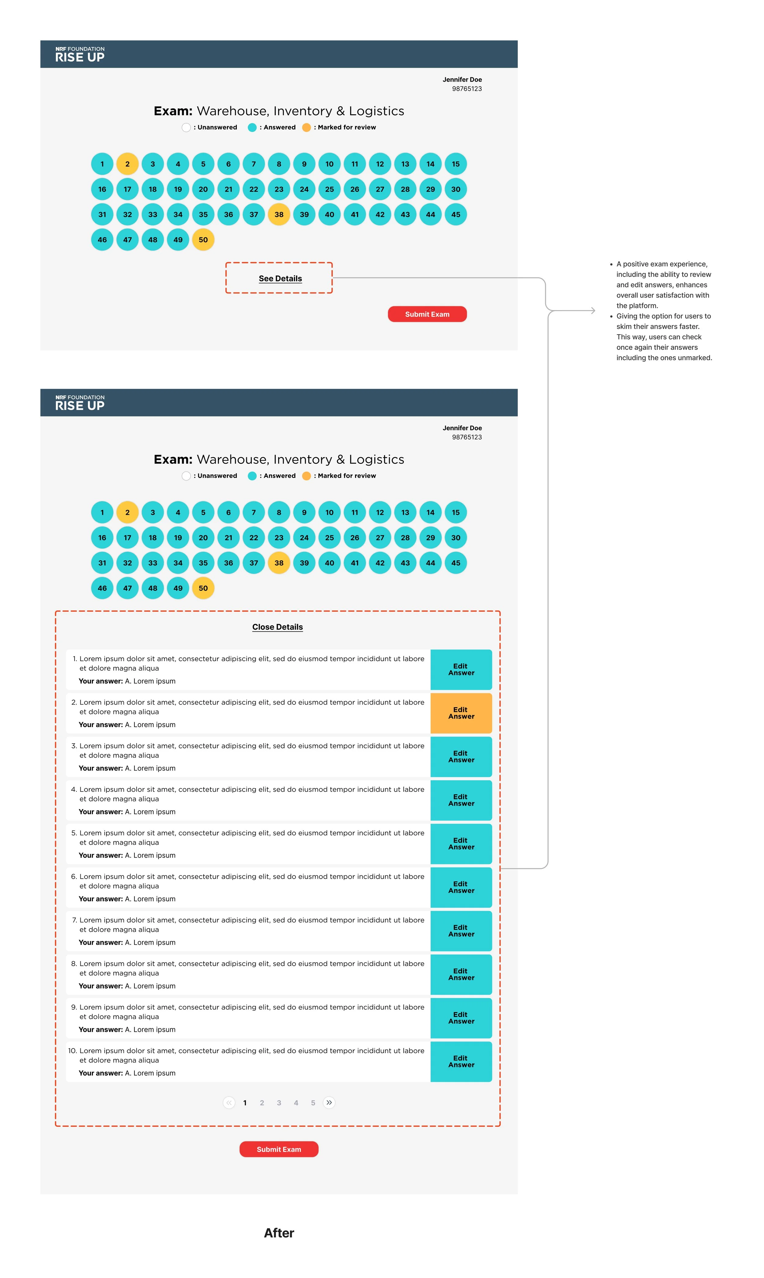
Even though we have provided Mark for Review so they can revisit the questions they are not confident with, users still want to see the detailed answers they have chosen before submitting the exam.
Addressing the users' feedback, I made the improvements to give better user experience.
Iterate the progress tracker, and warning button, and add a review answer button before users submits their answer.
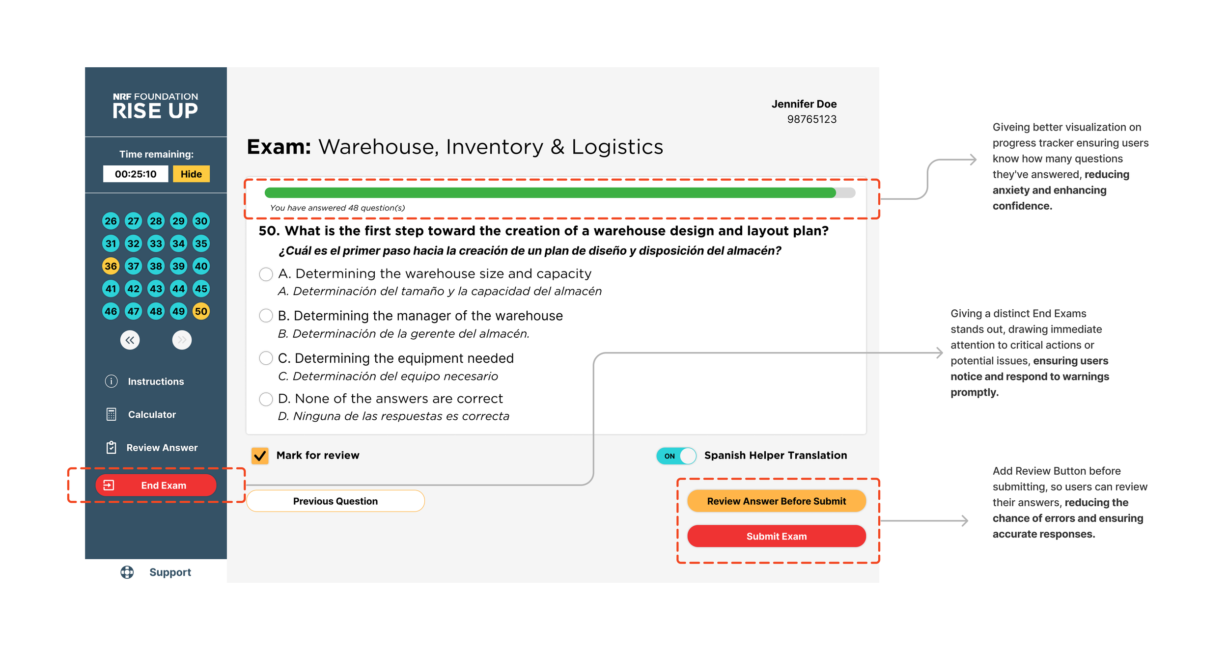
Improved Review Answers Page
FINAL PROTOTYPE
LESSONs learned & takeaways
Importance of Clear Progress Tracking
Users benefit from knowing exactly how many questions they've completed. This transparency reduces anxiety and helps them manage their time effectively.
Balancing Flexibility and Security
While a "Mark for Review" option is valuable, users also appreciate the ability to review their chosen answers before final submission. This empowers them to double-check their work without compromising exam security.
Potential Drawbacks on Translation Tools
While usability testing might reveal a desire for a translation tool, it's important to acknowledge potential drawbacks. First, accuracy, and machine translation can be imperfect, leading to misunderstandings or misinterpreted questions. Second, time management, Relying on translations can be time-consuming, potentially hindering exam completion. Third, focus and comprehension, constantly switching between languages can disrupt focus and hinder overall comprehension.